So, as I mentioned the other day, I designed a flyer to advertise modernevil.com – This weekend, Mandy and I selected a paper color (goldenrod, not too yellow, not too bright, eye-catching but also differentiated from the fluorescent yellow and orange flyers everyone else is posting), found some cheap copies (2c/copy at the UPS store at Dunlap & Central in Phoenix, if you pre-pay for 1k), and spent several hours cutting the little tear-off strips at the bottom of 250 pages. In the unlikely event that every strip gets torn off every flyer and all those strips convert to new readers, that’s 3,000 new readers. If some of them actually buy books – hooray!
Of course, that’s all dependent upon finding 250 places to post the flyers. (I’ll ignore for a moment the hundreds or thousands of people who will walk by each posted flyer without even seeing it, the dozens who will see it but not be interested, and the few who will be interested but lose the tiny strip of goldenrod paper they shoved in their pocket. First it has to be somewhere, and only then can it become ineffective!)
Yesterday, after stopping by the bank and Discount Tire (to pay for the tires I ordered – I get to go back Thursday afternoon and wait for them to actually get put on (ooh – I won’t really have internet access there to distract me, maybe if I take my laptop (or a pad of paper) I can get some work done!)), I started driving around a few places to see if they’d let me post the flyers. And to stop in to any independent book stores I saw, to see if they’d carry my books. Continue reading Hand-advertising; posting flyers
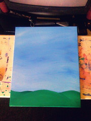
 As part of my efforts to not just write and paint full time, but to actually get my work out in front of people, visible to the world, and hopefully engage people’s interest, I am going to try to document my “process”… Whatever that means. In this case, it means that I have taken a series of photographs of the painting I created this week,
  Tuesday, it was time to begin the real work, so I booted up Photoshop and iPhoto, and got down to the digital part of the project. I took the photo from the previous day, and adjusted the image to “pop” the painting itself out of its background and into square, plus appropriately proportioned for the actual canvas size, as pictured at the right. This itself is a pretty straightforward thing to do, as long as you keep in mind that you don’t want PS to be creating any new information about your image – which is to say that all dimensions should stay the same or get smaller, never bigger. After this step, I cropped down so I was only working with the canvas, and then switched to iPhoto to find my “reference material”.